

 |
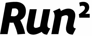
| Runners Point's application |
Visually and aurally the Board thought that the signs were relatively similar, but conceptually there were big differences. In particular, the Board thought that the “2” element was conceptually different, even if the average consumer might not understand exactly how. That seems to me to be predicated on an ignorance of mathematics consistent with a Daily Mail view of the education system: but then again, the idea of raising a physical activity to the power of two creates a likelihood of a different type of confusion. My old maths teacher, who would rate a wrong answer as "good enough for an engineer", or, if wildly wrong, a vet, might have been tempted to say "good enough for a trade mark lawyer".
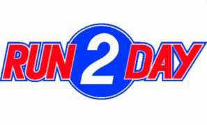 |
| Run 2 Day's figurative CTM |
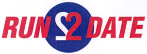 |
| Run 2 Day's figurative Benelux trade mark |
As for the value of the word RUN, the Board had contradicted itself by holding in paragraph 17 that the element RUN had to be considered identical, even though it was written in different case, but in the next paragraph suggesting that the case difference was important in the visual comparison. Finally, the Court said that Runners Point's sign will be read ‘RUN TOO’ or ‘RUN SQUARED’ by part of the relevant public while the earlier marks would be read ‘RUN TODAY’ (the Court called it a "jeu de mots", but it's a pretty exiguous one). It thought that the word ‘run’ could not be held insignificant in the comparison of the signs. As indeed it cannot, but if that's the best that can be said about a trade mark it's not a very good one, is it? The reason it's not insignificant is that all the signs involved are (IMHO) so pathetic.
The Court was also persuaded by the differences between the applicant's sign and the opponent's figurative marks, which had a lot more characters in them.
As far as the opponent's word trade mark was concerned the Court said:
... s’agissant de l’examen de la similitude visuelle, phonétique et conceptuelle entre la marque demandée et la marque verbale antérieure, la chambre de recours a commis des erreurs qui affectent le degré de similitude constaté des signes en conflit et vicient, par conséquent, son appréciation globale du risque de confusion opérée dans la décision attaquée.The Board made errors concerning the degree of conceptual similarity between the earlier word mark and the application, and these errors vitiated (nice word, ought to use it more) its global appreciation of the risk of confusion. So the Court upheld the opposition. It's a little difficult to disentangle the issues of similarity and confusion, especially with the Court's judgment being in French, but I think that quote helps.
But there are so many questions unanswered here. Why should any running shop be able to register a trade mark comprising, in large part, the word RUN? Should these marks not all have been rejected as too descriptive, or even as devoid of distinctive character? There would be a great deal less clutter on the register if, to use an unrelated athletic metaphor, the bar were set higher. Better to exercise your mind a little and come up with something original and memorable, or even inspired, like Sweatshop (which is, incidentally, registered on the basis of acquired distinctiveness to overcome an objection that it is descriptive of goods produced in a sweatshop. The mind boggles. As if anyone would build a brand on that proposition!) Why are Dutch and German companies addressing their customers in English, anyway? And finally, what happened to the apostrophe in the German company's name? If you're going to give yourself an English name, then at least get it grammatically correct!


No comments:
Post a Comment