Showing posts with label similarity. Show all posts

Thursday, 27 June 2013

General Court: Dialdi v Aldi - likelihood of confusion

In Case T-505/11 (25 June) Dialcos SpA applied to register the "slightly figurative" Community trade mark DIALDI for goods in Classes 29 and 30, including predominantly gluten free foods. Aldi GmbH & Co. KG opposed on the basis of their earlier CTM ALDI registered (in the OHIM tradition) for all the goods in the headings for those same classes.

The Opposition Division found that, notwithstanding that the goods were identical, there were sufficient differences between the mark and sign that there was no likelihood of confusion. The earlier mark could perhaps be considered highly distinctive but that makes no difference to the analysis (though one might argue that if the opponent's mark were highly distinctive, or otherwise easily recognised by consumers, the junior sign would not have to be as different as would be the case if there were less consumer recognition of the senior one - consumers would be less likely to be confused if they knew and recognised the senior mark). The Board of Appeal upheld that decision.

The General Court considered that the Board of Appeal had been correct to consider that the goods were intended for all consumers, notwithstanding that some of them were intended for a particular group. The goods are not hazardous, like pharmaceuticals, such that a higher level of attention might be expected from consumers. But the General Court still upheld the appeal.

It took the view that (contrary to the Board's view) you cannot assume that the relevant public will see the DIAL part of the applicant's sign as a separate element from the two final letters, which if they did would make the signs quite different: the public will not necessarily appreciate the "split" nature of the sign. The visual and aural differences did not counterbalance or outweigh the similarities. The Court therefore sent the case back to the Board of Appeal.

Tuesday, 25 June 2013

General Court thinks NICORONO is too similar to NICORETTE (and who can argue?)

Case T-580/11, McNeil AB v OHIM, involved an application to register the word mark NICORONO as a CTM, for aids to help smokers stop. In opposition proceedings, the Board of Appeal had decided that there was no likelihood of confusion although the goods were identical. The Court found (agreeing on this with the BoA) that the relevant public was professionals and consumers, and that the consumers involved, given that their health was at stake (should they have taken judicial notice of the fact that so many are in denial about this, I wonder?) would be particularly attentive.

The Court also agreed with the BoA that the "NICO" part of the mark, although not descriptive, as "highly evocative" of a characteristic of the goods and therefore only weakly distinctive. (To some of us, the name is highly evocative of the late Christa Päffgen, or even of Mr Ladenis and his excellent restaurants, but that's another matter, although I suppose it does go to the suitability of the word for trade mark purposes.) Where the Court differed from the Board was in its assessment of the power of the first four letters of the trade mark to attract the attention of the relevant public. Its length and leading position meant that it would do so as much as the "RONO" or "RETTE" part (and perhaps it is also worth noting that it's actually the first five letters that the marks have in common, although it's certainly the NICO element that carries the meaning). The similarities outweighed the differences, and visually, phonetically and conceptually the marks were similar. Which demonstrates the dangers of incorporating descriptive elements into your trade mark - taking the lazy route to creating a trade mark, perhaps, or trying to convey information about what the goods do not just who makes them.

Monday, 19 March 2012

A trade mark case I couldn't resist ...


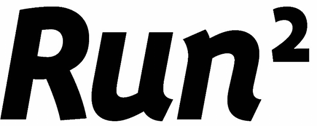
Runners Point's application
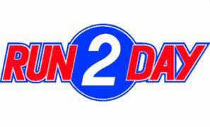
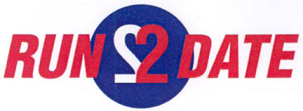
A Community trade mark case decided by the General Court a few weeks ago that definitely speaks my language - but a very unedifying decision it is. The Court decided, in Case T-64/11, that the sign above (the subject of the application, filed by Runners Point Warenhandels GmbH), was not similar to the CTMs below (registered by Run2Day Franchise BV) or to the RUN2DAY word CTM. The Board of Appeal had cancelled the Opposition Division's decision that there was a likelihood of confusion decision and rejected the opposition.

Visually and aurally the Board thought that the signs were relatively similar, but conceptually there were big differences. In particular, the Board thought that the “2” element was conceptually different, even if the average consumer might not understand exactly how. That seems to me to be predicated on an ignorance of mathematics consistent with a Daily Mail view of the education system: but then again, the idea of raising a physical activity to the power of two creates a likelihood of a different type of confusion. My old maths teacher, who would rate a wrong answer as "good enough for an engineer", or, if wildly wrong, a vet, might have been tempted to say "good enough for a trade mark lawyer".
Run 2 Day's figurative CTM
The Board also thought that the earlier marks have a weak distinctive character because they both use the descriptive word “run”. When you consider that as well as the differences, the Board thought there was enough to exclude confusion. In addition, the figurative trademarks present even more differences.
Run 2 Day's figurative Benelux trade mark
The General Court annulled the decision of the Office, drawing a distinction between the exponent and the cardinal number, and assuming a knowledge of mathematics on the part of the relevant public much greater than that assumed by the Board. Thank goodness for that.

As for the value of the word RUN, the Board had contradicted itself by holding in paragraph 17 that the element RUN had to be considered identical, even though it was written in different case, but in the next paragraph suggesting that the case difference was important in the visual comparison. Finally, the Court said that Runners Point's sign will be read ‘RUN TOO’ or ‘RUN SQUARED’ by part of the relevant public while the earlier marks would be read ‘RUN TODAY’ (the Court called it a "jeu de mots", but it's a pretty exiguous one). It thought that the word ‘run’ could not be held insignificant in the comparison of the signs. As indeed it cannot, but if that's the best that can be said about a trade mark it's not a very good one, is it? The reason it's not insignificant is that all the signs involved are (IMHO) so pathetic.

The Court was also persuaded by the differences between the applicant's sign and the opponent's figurative marks, which had a lot more characters in them.

As far as the opponent's word trade mark was concerned the Court said:
... s’agissant de l’examen de la similitude visuelle, phonétique et conceptuelle entre la marque demandée et la marque verbale antérieure, la chambre de recours a commis des erreurs qui affectent le degré de similitude constaté des signes en conflit et vicient, par conséquent, son appréciation globale du risque de confusion opérée dans la décision attaquée.
The Board  made errors concerning the degree of conceptual similarity between the earlier word mark and the application, and these errors vitiated (nice word, ought to use it more) its global appreciation of the risk of confusion. So the Court upheld the opposition. It's a little difficult to disentangle the issues of similarity and confusion, especially with the Court's judgment being in French, but I think that quote helps.

But there are so many questions unanswered here. Why should any running shop be able to register a trade mark comprising, in large part, the word RUN? Should these marks not all have been rejected as too descriptive, or even as devoid of distinctive character? There would be a great deal less clutter on the register if, to use an unrelated athletic metaphor, the bar were set higher. Better to exercise your mind a little and come up with something original and memorable, or even inspired, like Sweatshop (which is, incidentally, registered on the basis of acquired distinctiveness to overcome an objection that it is descriptive of goods produced in a sweatshop. The mind boggles. As if anyone would build a brand on that proposition!) Why are Dutch and German companies addressing their customers in English, anyway? And finally, what happened to the apostrophe in the German company's name? If you're going to give yourself an English name, then at least get it grammatically correct!
 

blogger templates | Make Money Online